User Friendly
In a now famous 2005 commencement speech at Kenyon College, David Foster Wallace opened with the following story:
There are these two young fish swimming along, and they happen to meet an older fish swimming the other way, who nods at them and says, “Morning, boys. How’s the water?” And the two young fish swim on for a bit, and then eventually one of them looks over at the other and goes, “What the hell is water?”
Today, the idea of “user-friendliness” is so ingrained, it’s become the water we swim in. We expect every product we interact with, from an MRI machine to filing our taxes, to be as easy as operating a smartphone app. Today, we take it for granted that most things we interact with don’t require us to read dictionary-length user manual.
“User Friendly: How the Hidden Rules of Design are Changing the way we Live, Work, and Play” examines the ways in which user-friendliness has penetrated everything we do. From the way things provide us feedback to the ways they silently explain themselves through metaphors, our world is becoming increasingly constructed. This is especially true as the internet and software integrates into all aspects of our lives.
In common use, user-friendly means “did this thing do what I wanted it to.” However, the task of user-friendly design is to fit a new product into our mental models of how something should work. Mental models are the theories each of us have which help us predict what will happen next. The job of a designer then is to discover these mental models and fit their products to them.
Three Mile Island
Why Design Matters
In 1979, a design flaw nearly caused a nuclear reactor to melt down at the Three Mile Island nuclear plant in Pennsylvania. At approximately 4:00am, the reactor entered a state of emergency shutdown. Despite the emergency system engaging, the pressure in the nuclear reactor continued to climb. Despite the controls room’s best mitigation efforts, the pressure continued to rise.
At one point, they wondered if a valve was locked open, and sent a man to check. The man walks to a panel in a back corner of the room, looks at the light, and sees that everything looks fine. He walks back and informs the control room that all valves are closed. Unfortunately, he looked at the wrong indicator light. No one in the control room knew the core was beginning to melt.
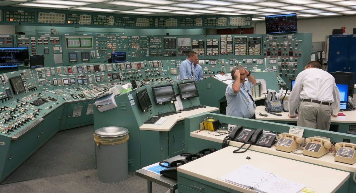
In total, the Three Mile Island control room had more than 1100 dials, gauges, and switch indicators. It had more than 600 warning lights. An investigation after the fact noted that for the warning lights, there were more than 14 meanings for red, and 11 for green. Further, the study found that some lights indicated intent, not action – the lights turned off when the switch was flipped, not when the valve closed. An indicator light like this can only say that things are going well.
The partial melt down of Three Mile Island is considered the greatest design failure in American history – it was nearly catastrophic. The control room was thrown together as a near after thought, with little thought given to the way thousands of flashing lights and alerts can overwhelm the operators in the control room.
Following the near melt down, nuclear control rooms were redesigned with clarity for the operator front of mind. For example:
- When everything is running smoothly, lights glow blue.
- The control room’s panels are mapped to match the layout of the plant.
- All panels are visible to from the lead controller’s seat
- When operators check indicator lights, they go in pairs
World War II
Necessity is the Engine of Innovation
In 1940, an Air Corps engineer remarked that bombers would be able to drop a bomb from 30,000 feet and hit within 15 feet of its target (1). In fact, data suggests that a bomber flying at 20,000 feet had a 1.2 percent probability of hitting a 100-foot-square target. The imprecision in the battlefield highlighted the important differences between the lab and reality.
As with most things, necessity brings about innovation. One of the most under appreciated ideas to emerge from WW2 was that machines should be designed to match humans. For example, the Air Force designed shaped knobs so that pilots flying night-time missions could know the function of a button simply by how it felt.
Further, the speed of battle forced engineers to create weapons that could be used and understood without second thought. Pilots didn’t have the option to pull out a user manual in the middle of a dog fight. It was this necessity that brought user friendly design to the mainstream. Humans tend to make similar mistakes, and if you solve for them, your product becomes more effective. Creating things for people as they are, instead of how they’re supposed to be, was a radical philosophical shift.
Feedback
How To Create Trust

Autonomous vehicles (AV) are getting better each day. While there remain many technical hurdles, many experts believe the greatest remaining hurdle is trust. While this may seem like a technical challenge, it’s actually a design challenge.
To help build trust between users and their AVs, Brian Lathrop, the head of user-experience at Volkswagen’s research lab, created four guiding rules:
- We need to know what mode the car is in – Autonomous or manual
- We need to know what is going to happen before it occurs
- We need to see what the car is seeing
- We need clearly marked transitions between autonomous and manual
These rules are designed to follow polite driving etiquette and mirror human body language. We’re hard-wired to look for social cues in everything we do, and machines need to meet these expectations. For the average person to trust AVs, it needs to feel and act like the most polite human driver on the road.

To make users feel like an AV is trustworthy, the designers need to properly create feedback mechanisms. Feedback, core to creating user friendly designs, is how we interact with the world. When you swing an axe at a block of wood, it splits, or it doesn’t. This is called a feedback loop. It’s steps are:
- Input
- Confirmation
- Output
For machines, the confirmation step is critical to building trust and feeling human. While we may not notice when it’s working, we all notice when it’s missing. For example, left-clicking a mouse is accompanied by an audible “click” to confirm that the button was correctly pressed. The lever on a toaster clicks into place when it has been depressed far enough to turn on. A light switch physically changes positions and often emits a noise to indicate it’s been flipped.
In contrast, we’ve all had moments when feedback was lacking. When you click a link in an email but it doesn’t open. When you press the button on your remote but the channel doesn’t change. When this happens, I often mash the button multiple times, or click the link 20 times, and end up loading 20 useless tabs or find myslef 100 channels away from where I wanted. When feedback loops breakdown or are poorly designed, we struggle to control the machines around us.
For Brian Lathrop and the Volkswagen group, this means an AV will tell you it’s about to make a turn, perform the turn, and confirm to the user it has completed the turn. As these feedback loops are tuned to our expectations, AVs will become a normality and eventually boring.
Metaphors
The Way We Understand the World

While feedback loops are used to build trust, metaphors are used to help us understand. Metaphors are fundamental to the way we speak, think, and interact with the world. (2) In design, metaphors help quickly define and provide mental models to think about new products. Metaphors help to make foreign things feel familiar by silently explaining how it works.
In the West, we take for granted that the internet is built on our metaphors. For example, an email inbox relies on metaphors for the ways a physical letter is delivered. It creates expectations that after waiting a certain period of time, an external force will populate the inbox with electronic letters. For users who’ve never received a physical letter, these metaphors don’t make sense.
The most influential metaphor of the 20th century is the metaphor of the desktop inherent in modern computers. For example, windows are designed to feel like pieces of paper on top of a physical desk, stacking and sliding to meet the user’s needs. Files and folders are like the drawers on a desk. Accessories (programs) like a calculator or notepad are saved on the desktop for easy access.
Once a metaphor’s logic becomes ingrained, we stop noticing it. I have been “saving files to my desktop” for most of my life without knowing what it was referencing. The rise of the smartphone is challenging these foundational metaphors. We no longer need the desktop metaphor to explain how to use a modern computer. To digest new technologies, we climb a ladder of metaphors, with each rung helping set up the next.
Humanity
Different Strokes, Different Folks
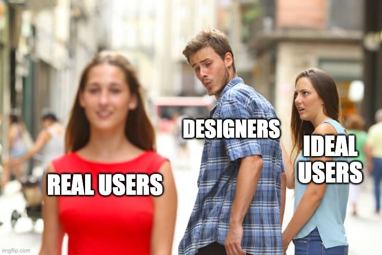
One design maxim is that if you design for everyone, you design for no one. If designers are to create user-friendly designs, they need to personalize as much as possible.
In 2013, Disney World created a wristband which tracked the precise location of users throughout the parks. Immense amounts of user data were stored on the device, from credit cards to food allergies, enabling truly frictionless interactions. A family would walk into a restaurant, sit down, and their food would be paid for and on the way to the table without speaking to anyone.
Disney’s wristbands turned total surveillance into total personalization. While a bartender will be told by their screen that it is a customer’s birthday, instead of bringing over a free drink, the bartender will ask if the customer is celebrating a special occasion. This creates a way for the customer to socially reveal or not reveal their birthday. The bartender knows it's the customer's birthday, but it would be rude not to ask. "Rudeness" can really be interpreted as a breach of social norms. As the devices around us become more capable, they’ll need to become more polite, more personalized, and more socially aware.
To create personalized, user-friendly products which follow social norms, designers will need to match different cultural expectations as well. In China, for instance, smartphones are used very differently than they are in the West. As discussed in AI Superpowers, many Chinese users skipped landline phones and desktop computers and jumped directly to mobile. By skipping steps in the metaphor ladder, applications which are dominant in the West failed to appeal to Chinese users.
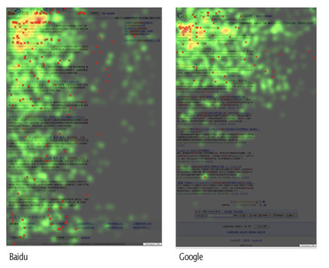
As of December 2021, Baidu controls 85.48% of the Chinese search engine market. Google controls only 2.93%. A study from 2007 explains that Baidu is designed to match the expectations of Chinese users (link). While some differences can certainly be attributed to the Chinese Communist Party, much of the differences are deeper. For example, eye-tracking data shows that Chinese users tend to jump around a page while western users read slowly from top left to bottom right.
Baidu designed to match the mental models of the Chinese consumer. Naver, this most popular search engine in South Korea, is similarly designed to meet the expectations of its local market. Google failed to account for these changes and is seriously lagging in both markets.
Promise and Peril
The Future is Designed
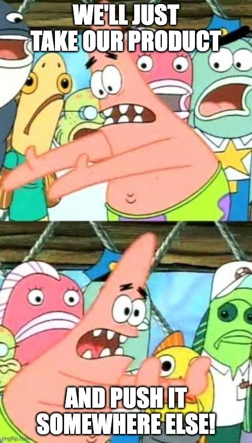
While user-friendly design began by matching the machine to the user, it can easily be used to manipulate users by manipulating the ways they interact with the product.
Burrhus Frederic Skinner, an American psychologist at Harvard, was a pioneer in the field of behaviorism. His research focused on the ways stimulus reinforced behaviors.
Looking at the brain activity of rats, Skinner discovered the importance of unexpected rewards. When rewards came regularly, the rat's brain activity saw a moderate change. However, when rewards were given at random, the brain activity went off the charts. This principle can be easily seen in humans as well. While gambling is the most obvious example, our enjoyment of underdog sports stories is also an example. The most memorable stories are the ones with an unexpected outcome.
While tech companies argue they’re improving the design of their products, there are a shocking number of similarities between the modern smartphone and a slot machine. Twitter, Instagram, Snapchat, and even LinkedIn all use a variation of swiping down to refresh and receive new content. This gesture is akin to pulling the lever on a slot machine for an unknown reward. Tinder is proud of this fact, with each swipe serving as a pull of the slot machine lever, addicting users to the thought that the next jackpot could be right around the corner.
The danger of user-friendly design is that it’s principles can quickly and easily be used for manipulation. Instead of meeting people where they are, designers are guiding the user towards certain actions. As technology integrates further into every aspect of our lives, and the spaces we inhabit are increasingly designed to match us individually, we need to be aware that our products are not value neutral.
Markup
Other Tidbits
Easy To Use
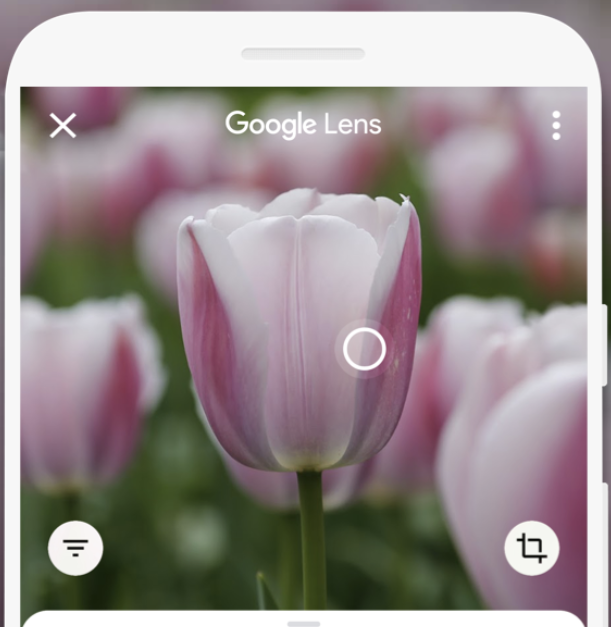
One example the authors bring up is Google Lens. To use Google Lens, the user opens the app and points the camera at an object they’d like to better understand. Using AI, the software quickly determines what it is looking at and then, based on context clues, will suggest a meaning to the user. Google Lens works on everything from translations to math problems.
What’s so interesting about Google Lens is that it doesn’t have a user manual, which gets crazier the more you think about it. The AI is scanning an object , comparing to billions of data points collected by Google, and then answers the question it predicts you’re asking. This is one of the most advanced Ais in the world, but it doesn’t even have a user manual. It’s just point and shoot.

iPhone Home Button
Apple has the greatest product design team in the world; all of their products are finely tuned to match consumer mental models and metaphors. For instance, in 2017 Apple release the iPhone X, the first iPhone which didn’t have a physical home button. This change, while somewhat subtle, was the culmination of years of product design work.
The original iPhone had no implicit need for a home button. If the designers had wanted, they could have started the original iPhone with the “swipe up” command of the iPhone X. By including a home button, the designers were helping transition users towards a buttonless device. The physical button service as a tactile feedback loop and stopped users from becoming overwhelmed. As we look at Apple’s other products, it’s easy to speculate which design choices are being used to prepare consumer for Apple’s next big launch.
Death by Design?
In 2013, when speaking to group of Yale students, Paypal co-founder Peter Theil remarked that “we wanted flying cars, instead we got 140 characters.”(link) Elon Musk shares a similar vision – instead of inventing world changing feats of engineering, our world’s smartest people are working to invent the next Facebook. I wonder if this long-term trend, which both men are tirelessly trying to change, stems from user-friendliness.
As mentioned above, user-friendliness is about molding machine to people. To best do this, product designers focus on the people (internal) instead of the problem (external). Instead of building ugly flying cars, our best and brightest are building beautiful addictive algorithms. To change the outcome, companies may need to reexamine their prioritization of usability.
Designing for Disability
While somewhat counterintuitive, by designing products which are user-friendly for people with disabilities, we can increase the function for all users. For example, imagine a smartphone designed for people who only have one arm. This design change is also helpful for more traditional users who’s hands are full but still need to use their phone. By working to solve challenging problems for people with disabilities, everyone benefits. As discussed in the World War II section, necessity is the engine of innovation.
That's it for this article. Remember, if you enjoy the content, subscribe on the right and forward to your friends.